As we are moving over to Google Classroom, you will find this and your other tasks there. It is best that you respond from Google Classroom if you can.
See you there!😃
Maths
Statistics: What can we learn from bar charts and graphs?

What are the features of a graph?
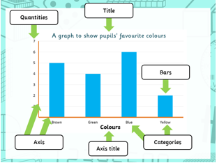
Have a look at this example:
On the page below, look carefully at the graph which shows How many sandwiches are sold every hour. You will see the questions below it for you to answer.
We are able to interpret lots of information from just one graph. This means to understand what it shows.
Look carefully at this bar graph which we will be using for all of our questions today:

1) How many sandwiches are sold between 8:00am and 9:00pm? Answer:
2) How many more sandwiches are sold between 12:00pm and 1:00pm than between 9:00am and 10:00am?
Answer:
3) Which times of the day are the most sandwiches sold? Why do you think this is?
Answer:
4) Looking at the graph, what time do you think the sandwich shop opens?
Answer:
Increase means to become greater in amount:
5) Why do you think there is a sudden increase of sandwiches being sold at 5 o’clock?
Answer:
6) The owner of the shop wants to put another member of staff on to cover tomorrow’s busiest time.
What time do you think the owner will tell them they have to work?
Answer:
From just looking at the data this graph is showing, we have managed to answer 4 questions by interpreting the data. The graph itself did not show these answers, yet you have been able to work those ones out! Well done!
And finally,
7) How many more sandwiches were sold between midday to 1:00pm than 10:00am to 11:00am? Answer:


